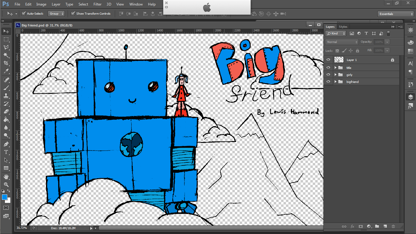
This afternoon, I have been colouring the front cover of Big Friend, using Photoshop.
Here is the initial sketch, altered using the
Levels and
Threshold utilities, to bring out the lines to a much fuller form. I also used the
Magic Wand tool to remove the papery background, leaving only the lineart.
I then grabbed my colour wheel, and isolated two bands of colour that I wanted to use. I have chosen opposing colour bands, so I can use a complimentary colour scheme.
I then coloured in big friend, using the
Pen tool. I've chosen cool, blue colours, to match the character's mood and temperament. The orange in his eyes is there to represent his warm heart - it is said that the eyes are windows to the soul, after all.
Next, his little lady friend got colours. Her colour palette is designed to oppose Big Friend's. Perhaps in the story, she's originally very negative towards him, but later changes her mind?
The 'BIG' in the title has been coloured using Big Friend and the lady robot's predominant colours. The patches are coloured with the lady robot's orange, to give the message that she 'fixes' him.
The mountains then use dark, browny oranges. However, I have made them to be more subdued, to clarify depth. The snow is also a very light blue.
I found it very difficult to mix an orangey hue for the sun, and also thought that it added some unneeded clutter to the scene, so I instead removed the sun altogether - it's probably in front of the robots. I also coloured in the clouds with the same blue as the snowcaps on the mountains.
I then created a duplicate of the colour shape for the front cloud, and altered it's colour and
layer style so as to give the impression of it casting a shadow on Big Friend. I used the
eraser to remove any bits of shadow that weren't needed.
All done! Tomorrow, I shall be producing the back cover, and the spine, using the same methods that I've used here. I may also make some changes to this front cover, too. We'll see!


No comments:
Post a Comment